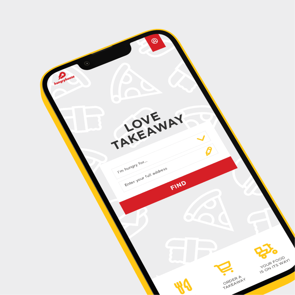
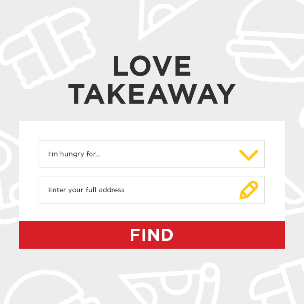
Delivery Hero

A food delivery portal for the UK

Delivery Hero

A food delivery portal for the UK

Delivery Hero

A food delivery portal for the UK

Hungryhouse, now part of Just Eat, was a major food delivery portal in the UK, part of the Delivery Hero holding.


During my employment at Delivery Hero, I was tasked with building the new Hungryhouse website from the ground up, based on the redesigned design language that launched in Germany for Lieferheld. One of the options that I offered remains, to this day, a project that holds up and that still I'm proud of.


My aim for this version of the platform was to push the limits of the new design system. Most of it being quite conventional for the time, I wanted to give it a more current and dynamic approach, with a clearer visual hierarchy.


Keep in mind that the content and copy were kept 1:1 from the original website.

Here are a few screens!

Disciplines


UI/UX

Web design

Draft

Year


2017

Disciplines


UI/UX

Web design

Draft

Year


2017

Disciplines


UI/UX

Web design

Draft

Year


2017

Homepage

Search for the right restaurant

My homepage shows the same content as the final one. It's not extensive, but shows a focus on the search for restaurants. "What do you want?" and "Where do you live?" - Boom, simple. We wanted people interacting with this right away, so everything else was secondary.


The only colors that the brand used were red and yellow, so red CTAs couldn't be more attention-catching. There's a sense of urgency that might be a bit too alarming for CTAs, but that worked great when the platform was in operation.
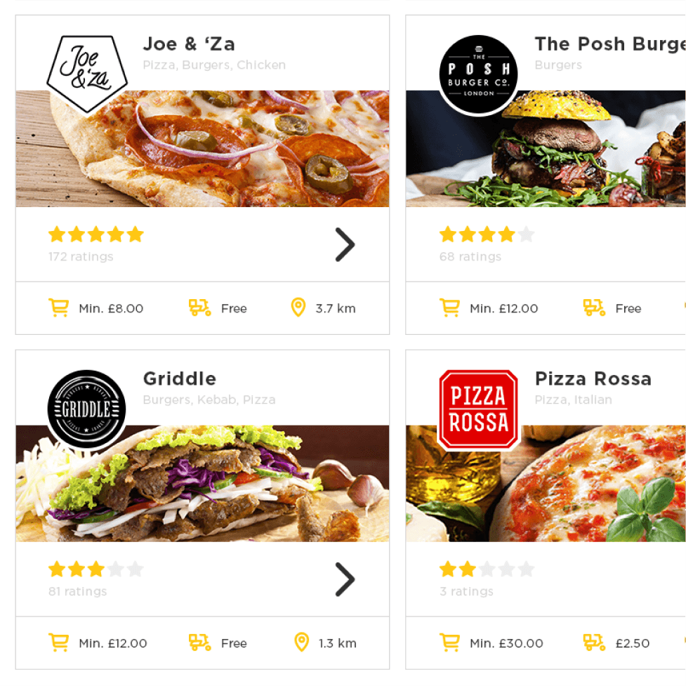
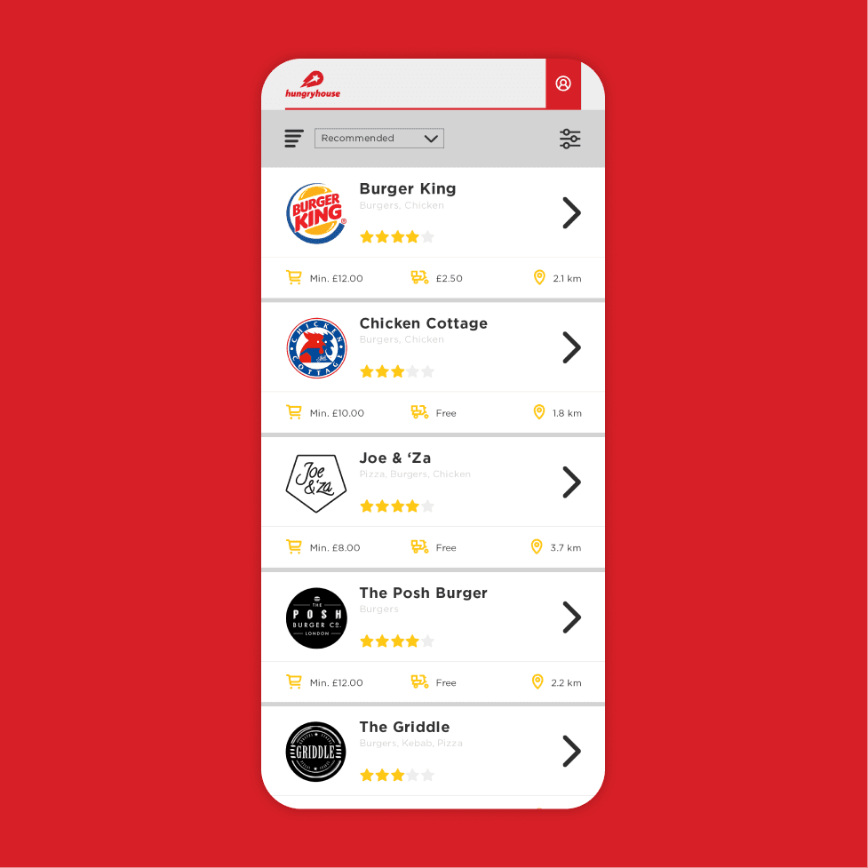
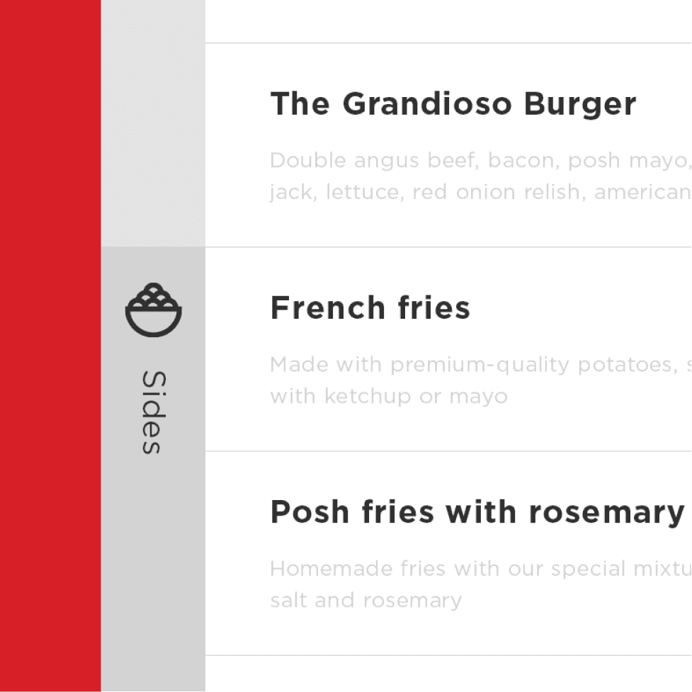
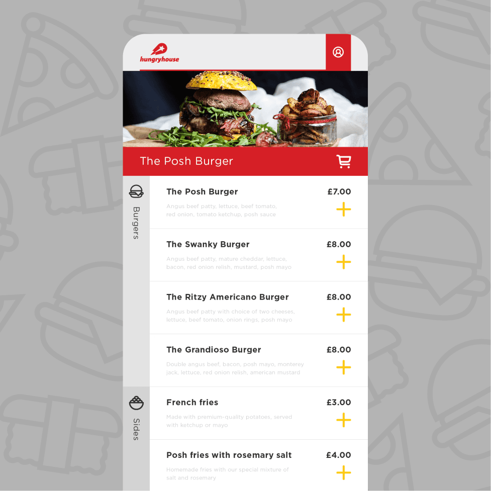
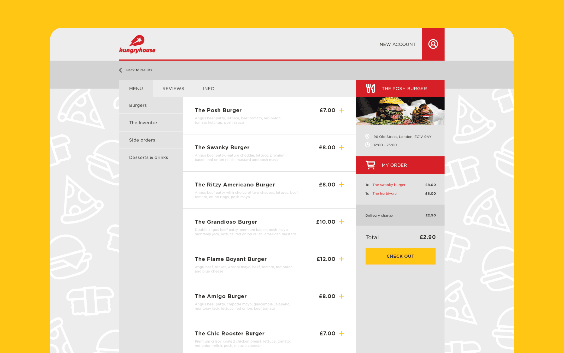
Restaurant list

Make your choice

This is where users see how many restaurants fit their search criteria, and get to make a decision.


The visual focus for each restaurant is to show the delicious food. When you're hungry, that's what gets you to click on a restaurant over another. At a glance, per restaurant, you get key takeaways of each place right away: ratings, minimum order, delivery fee and distance from you. The visual hierarchy is made so that you start from seeing a solution to your hunger, then get convinced very quickly by the key elements underneath.


The filters are very accessible and visible, in the left column, to limit the number of clicks needed to personalize a search and stay on topic. After all, the goal is to get you to make that choice quickly and get you fed!

  • Oh hey! Nice to have you here.

  • I can bring your project to life ✨

  • I hope you're having a nice day!

  • Let's work together 🪄