Logo
Finding the right hero for the job
The hero logo is born of the idea of simplifying the classic depiction of a flying superhero. Two arms, one outstretched, with the head in between. It also forms an H, for Hero. The angle adds a layer of dynamism and forward motion. There is also a subtle keyhole shape that can be imagined in the glyph.
The challenge was to keep our hero alive and well, while bringing him into today’s era. Through trial and error, research and comparisons, the new hero was born.


Typography
How do we spell those keywords?

Colors
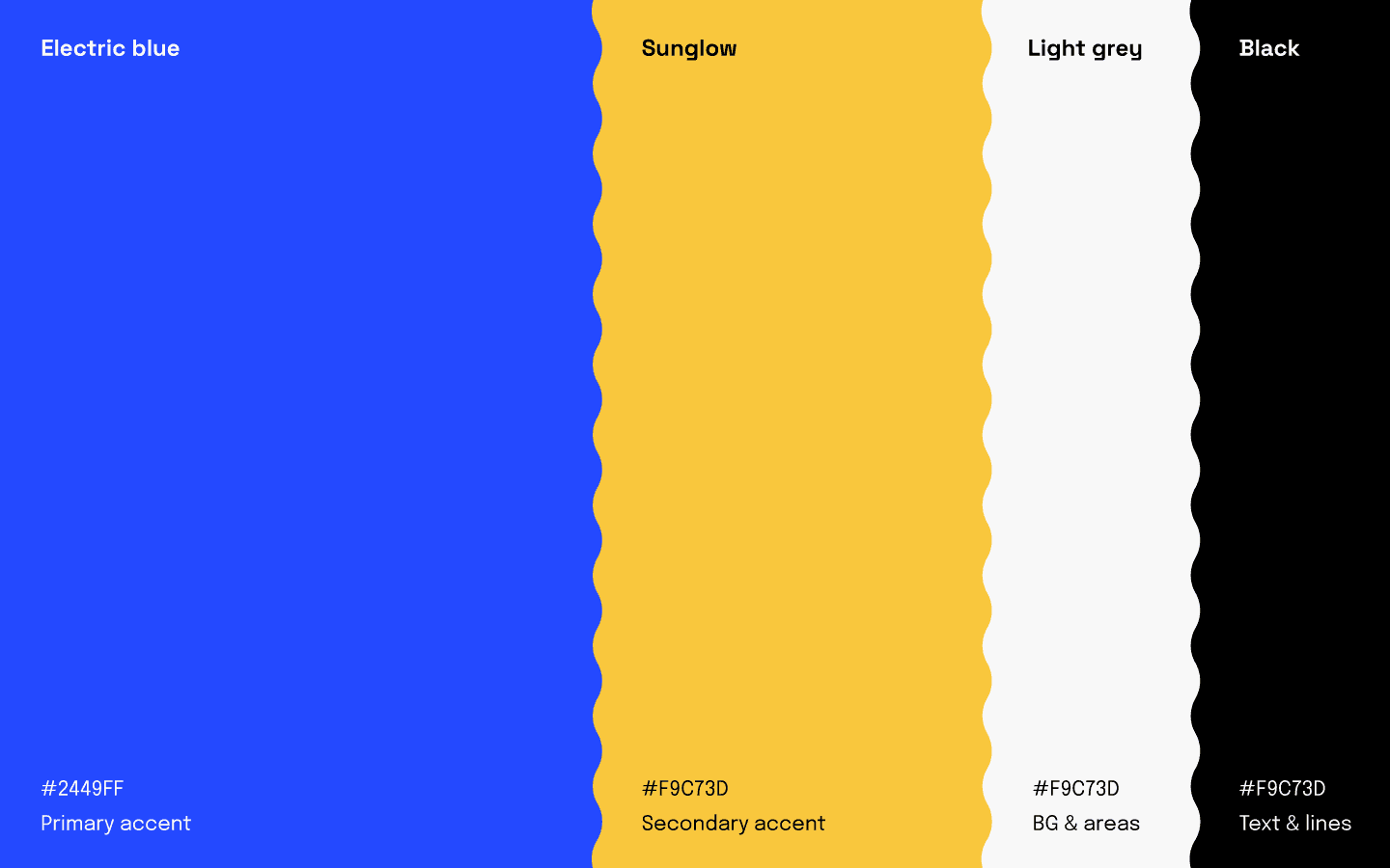
The color of the outfit
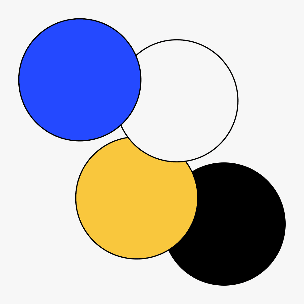
When it came to color choices, the palette had to appeal to the data-driven, internet-based userbase, while remaining modern and fresh. The old color palette was a bit all over the place, and needed a drastic clean-up. The classic electric blue was picked, almost to remind you of Window’s infamous blue screens of death, but without the panic.
As an accent color, a strong contrasting yellow called itself as a great counterpart to the blue, bringing enough contrast for highlights throughout the website, as well as attention-grabbing CTAs.
The original brand’s colors were all over the place, and presented a challenge. While starting to sort and decide what was already being associated with the brand, while discarding the superfluous ones, we ended up starting fresh with a new set of tones.

Website
The key to clarity
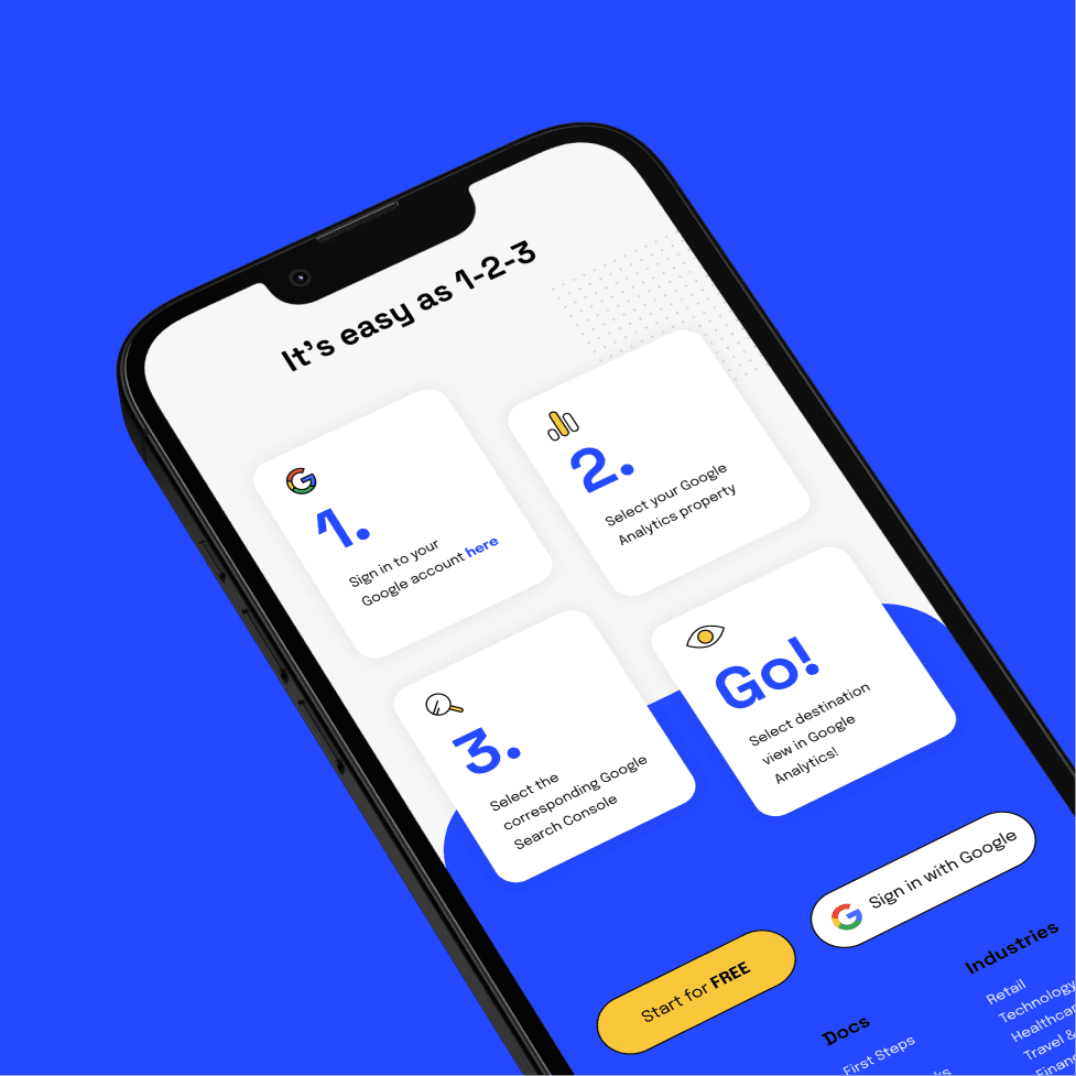
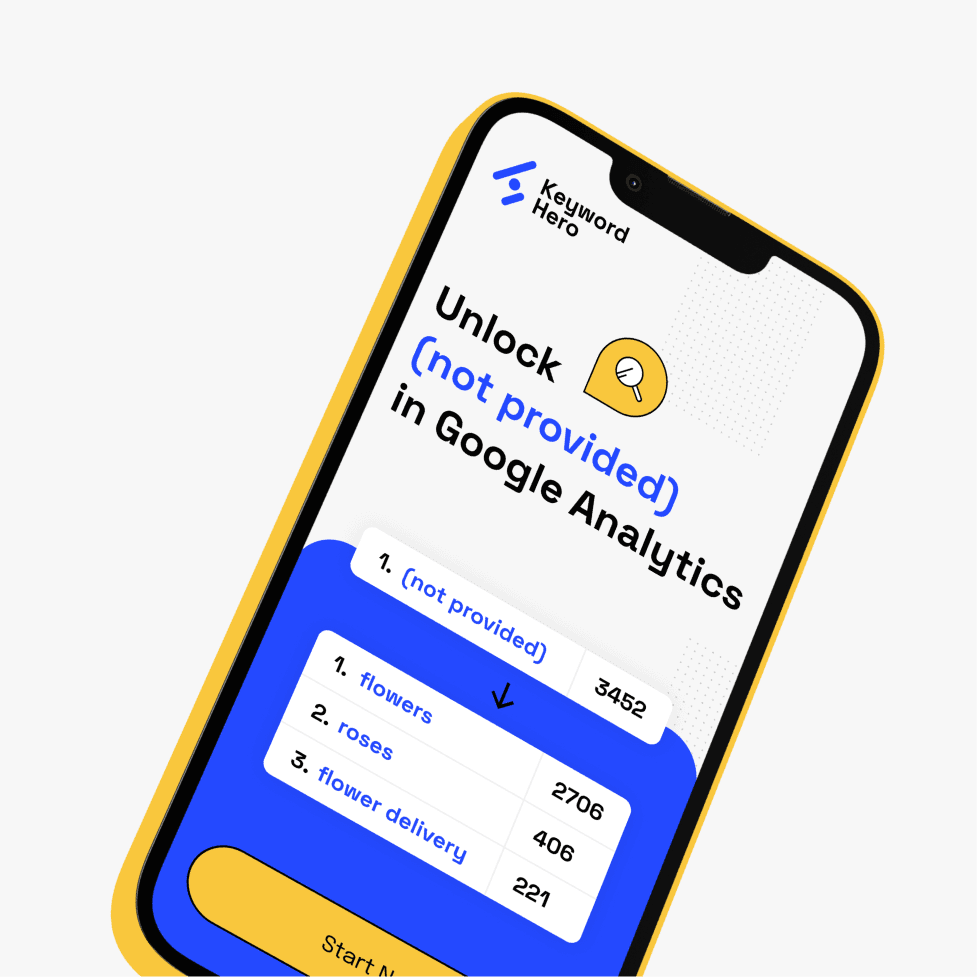
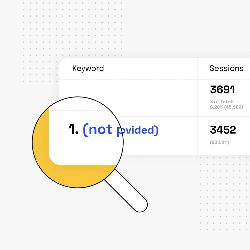
The responsive website started as a full redesign of the existing one, keeping most content and sections as-is. The layout is simple, and the flow has only one goal in mind: make the potential customers understand what Keyword Hero does quickly and painlessly.
The original website wasn’t planned properly, used too many colors, and needed some visual clarity. Graphs and tables were redrawn in a clearer, more visually appealing way, with illustrations and icons emphasizing what needs to be looked at. Tons of pages were created, but for the sake of this case study, here’s a greatest hits compilation of the Home and About pages.
👇 Swipe left or right


Marketing
Being visible
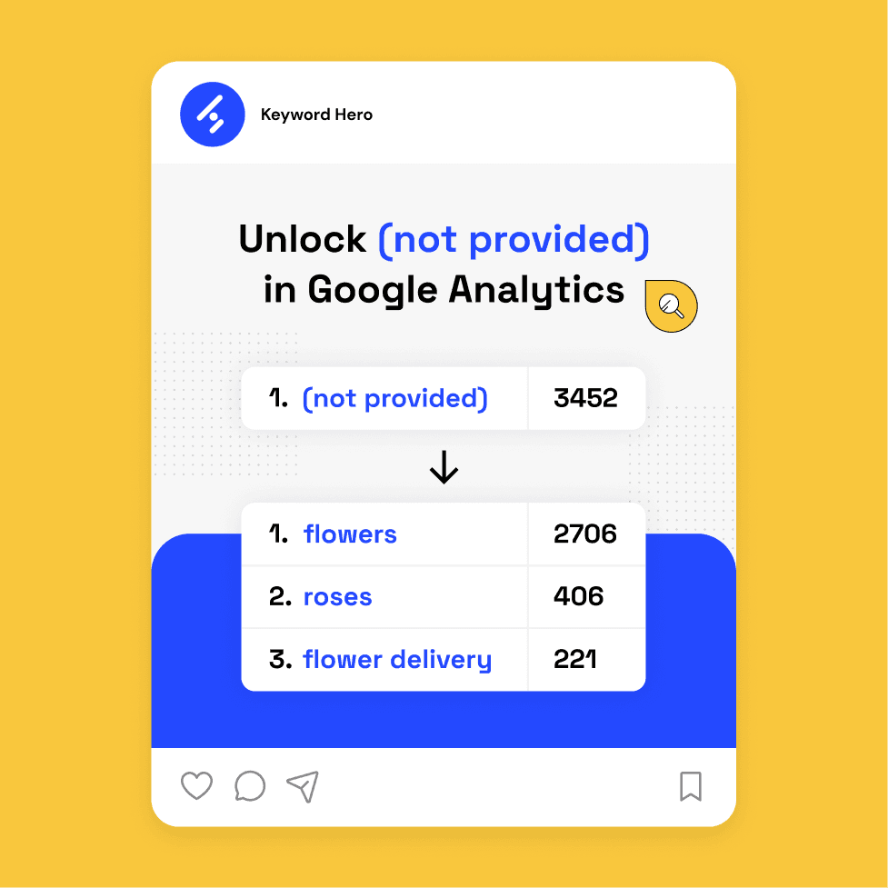
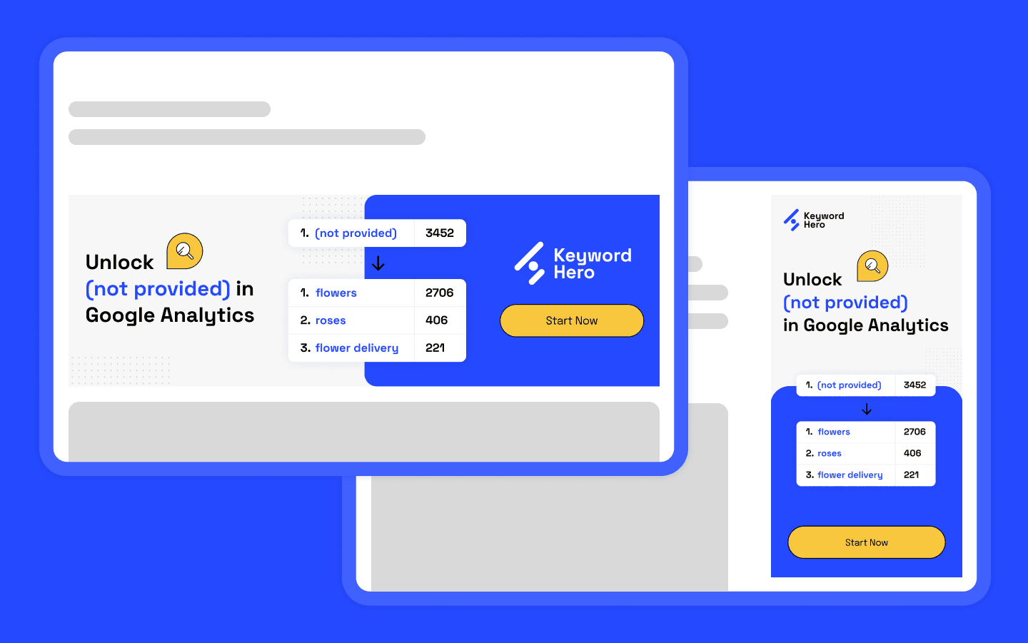
Going from the website’s direction and new brand guidelines, we started producing ideas for a first marketing campaign, in the form of display banners.
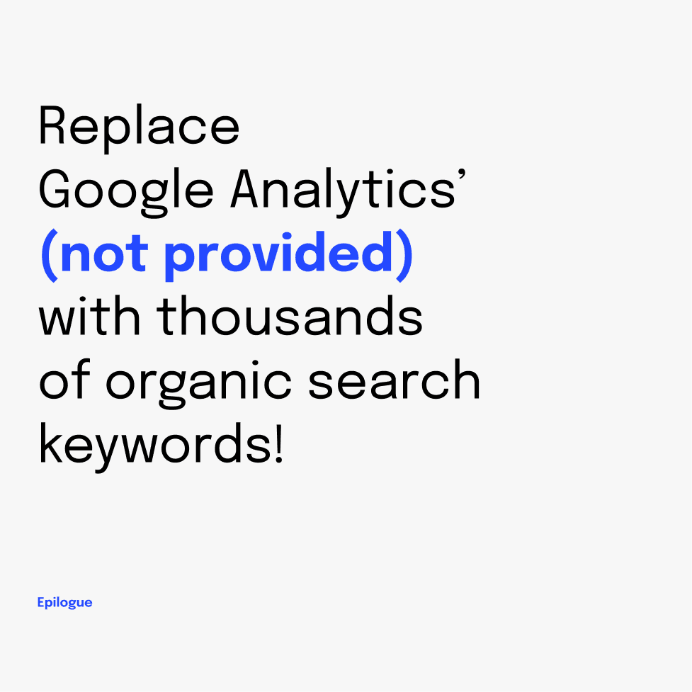
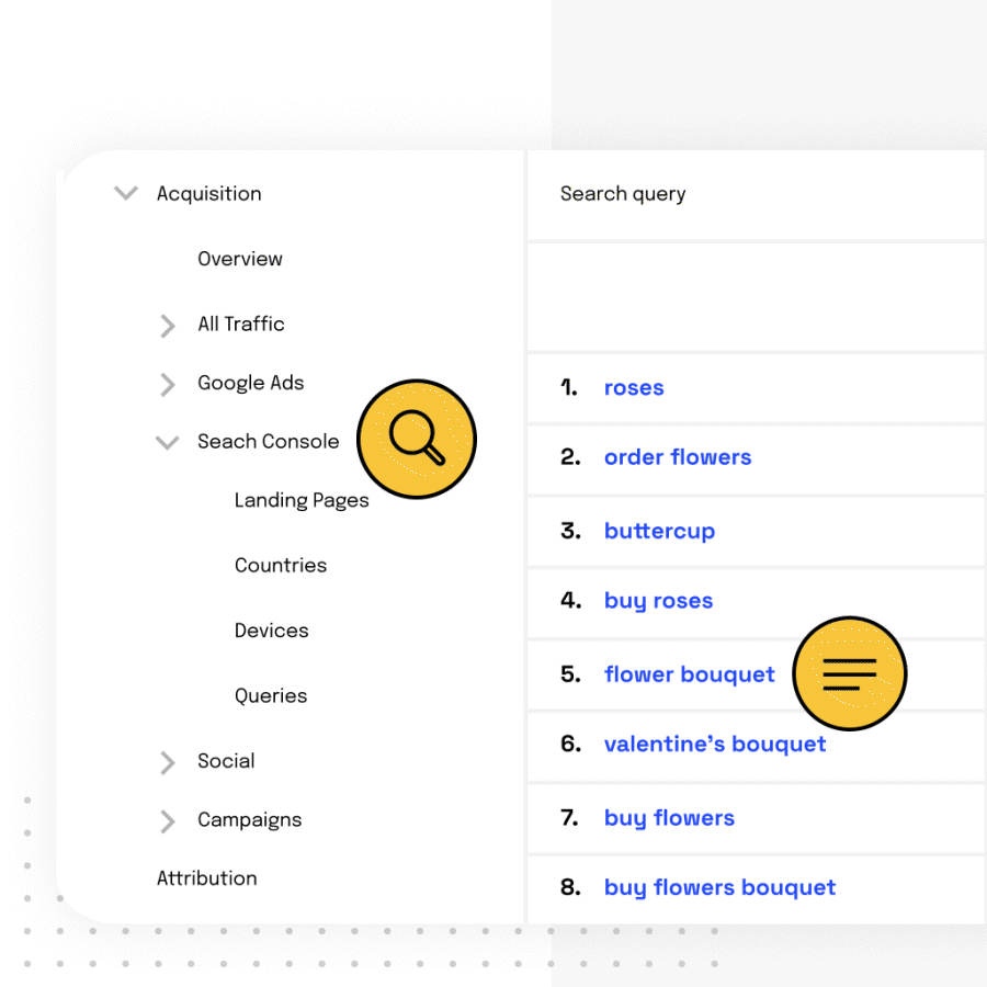
The product being very specific and niche in its use, the campaign idea aims to explains right away what Keyword Hero does. A simple table that shows you what happens to your keywords, a big mention of Google Analytics, and a clear CTA. Straight to the point.
Icons & illustrations
Communication building blocks
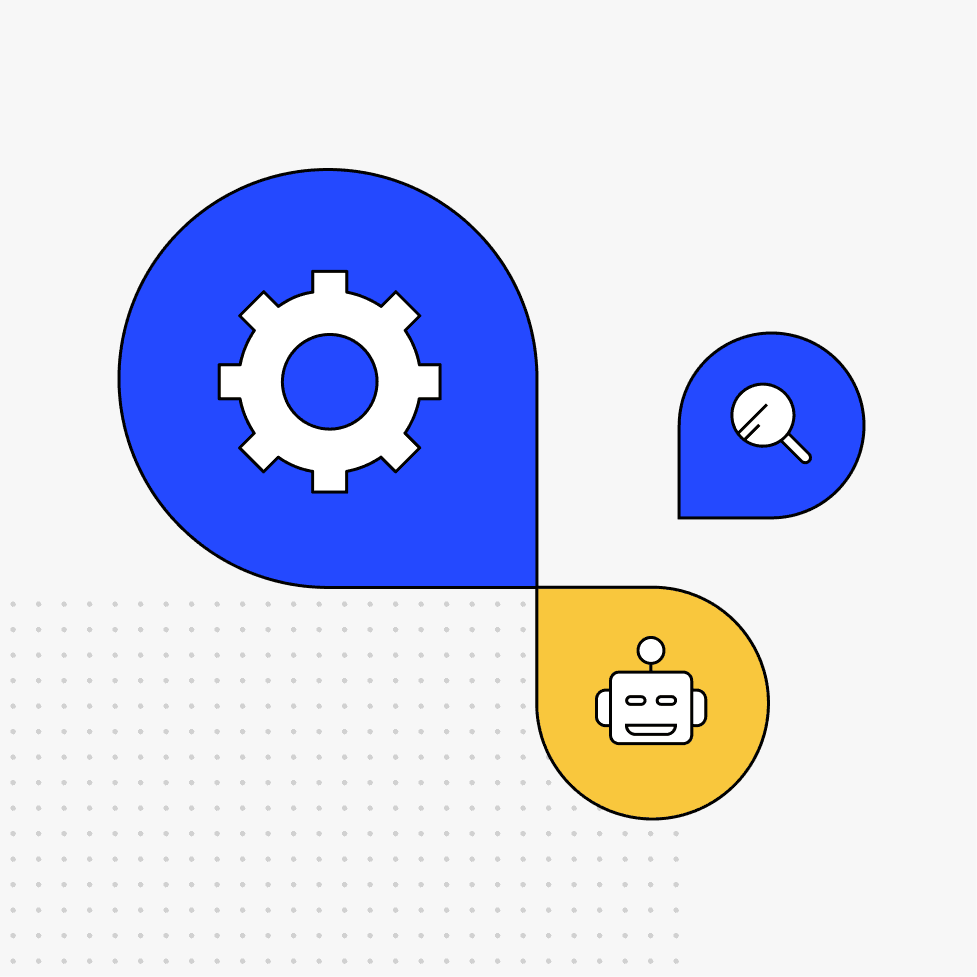
To illustrate and punctuate the reading, I came up with a very basic, colorful type of illustration that will be easy to reproduce in the future because of its modularity.
A shape that comes back often throughout the design is the “spotlight”, or the circle with one pointed corner. It’s a pictorial, slightly abstract way to echo back to the homepage’s spotlight, kind of like a bat signal, in line with our superhero theme.

Oh hey! Nice to have you here.
I can bring your project to life ✨
I hope you're having a nice day!
Let's work together 🪄