Logo
Spotter is born
To illustrate what Spotter does and initiate brand recognition, we thought that having a strong logotype would be a good starting point. The modified font (Gilroy Black) show what resembles binoculars, or opera glasses, to visually represent how Spotter has all of your assets in sight. It spots everything!

Typography
Gilroy all the way
Showcasing the mission in a bold way required a bold font. The product being quite techy and aimed at people who were already working in tech and design, we wanted to use a bold, no-frill, clear typeface. The Gilroy font family presented itself as a nice option for both our big headlines, and clear, concise body copy.


Colors
A spot of color
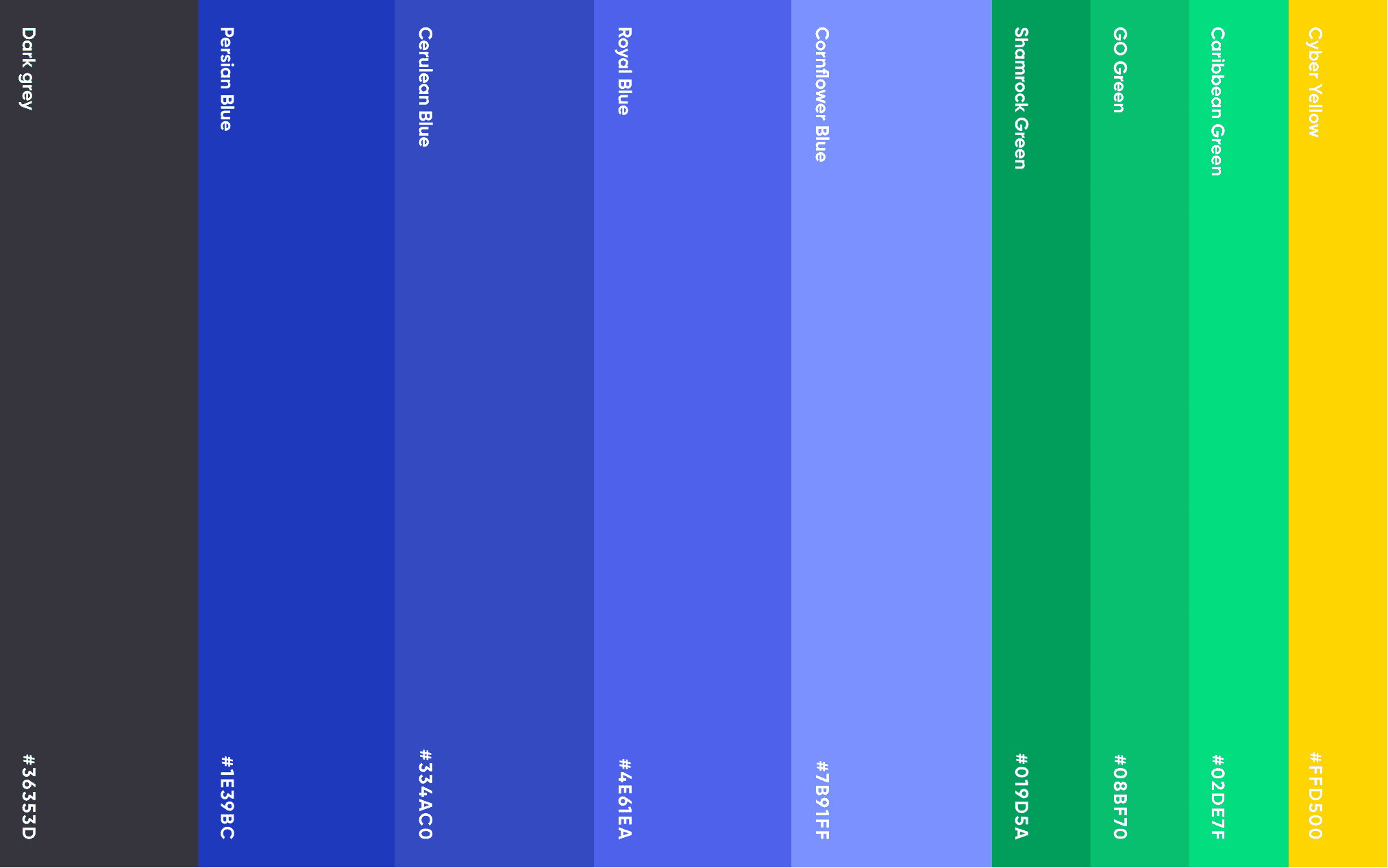
In the case of this "v1.0" brand, we decided to keep things simple and minimal by mainly using shades of blue. The reasoning was that as Spotter brings all of your assets together in one place, one main color scheme would make Spotter stand out. The same way that on my portfolio, everything except the work is black and white, the focus would remain on the images. That blue = Spotter.
For additional accents, a dark grey was chosen instead of a black, as a softer solution, as well as a few tiny accents of yellow and green to break the monotony of the all-blue images and icons.


Web app
An interface for content
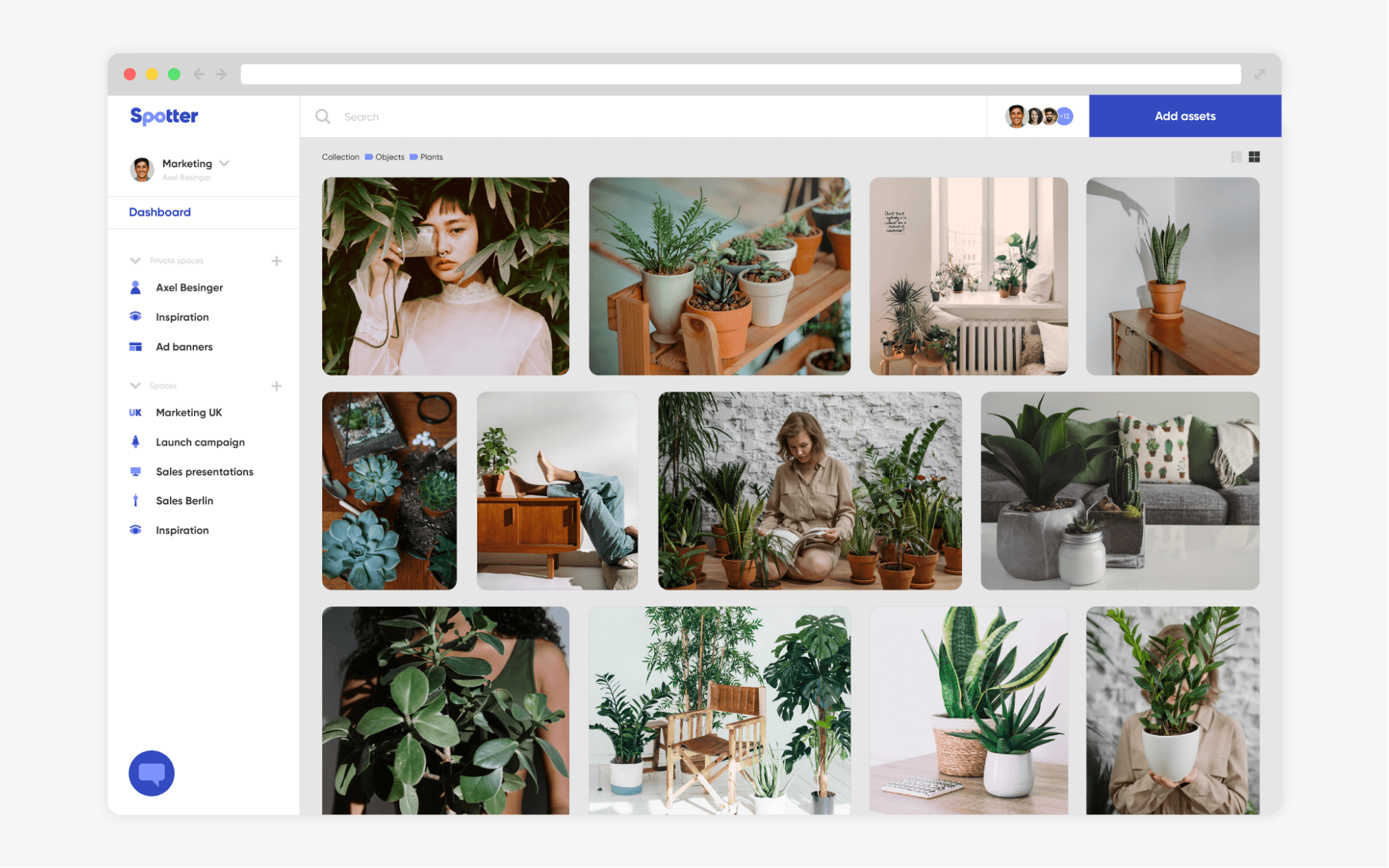
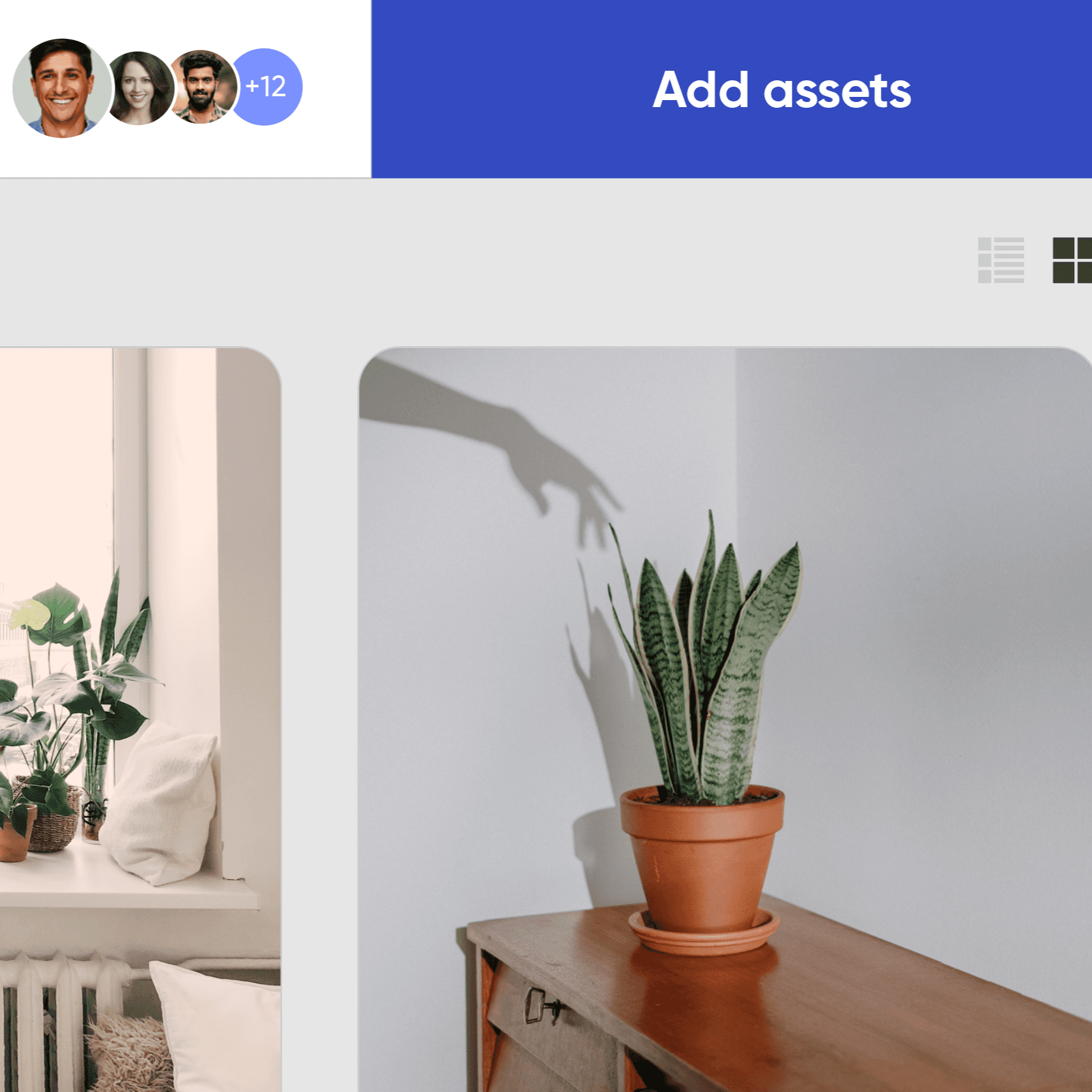
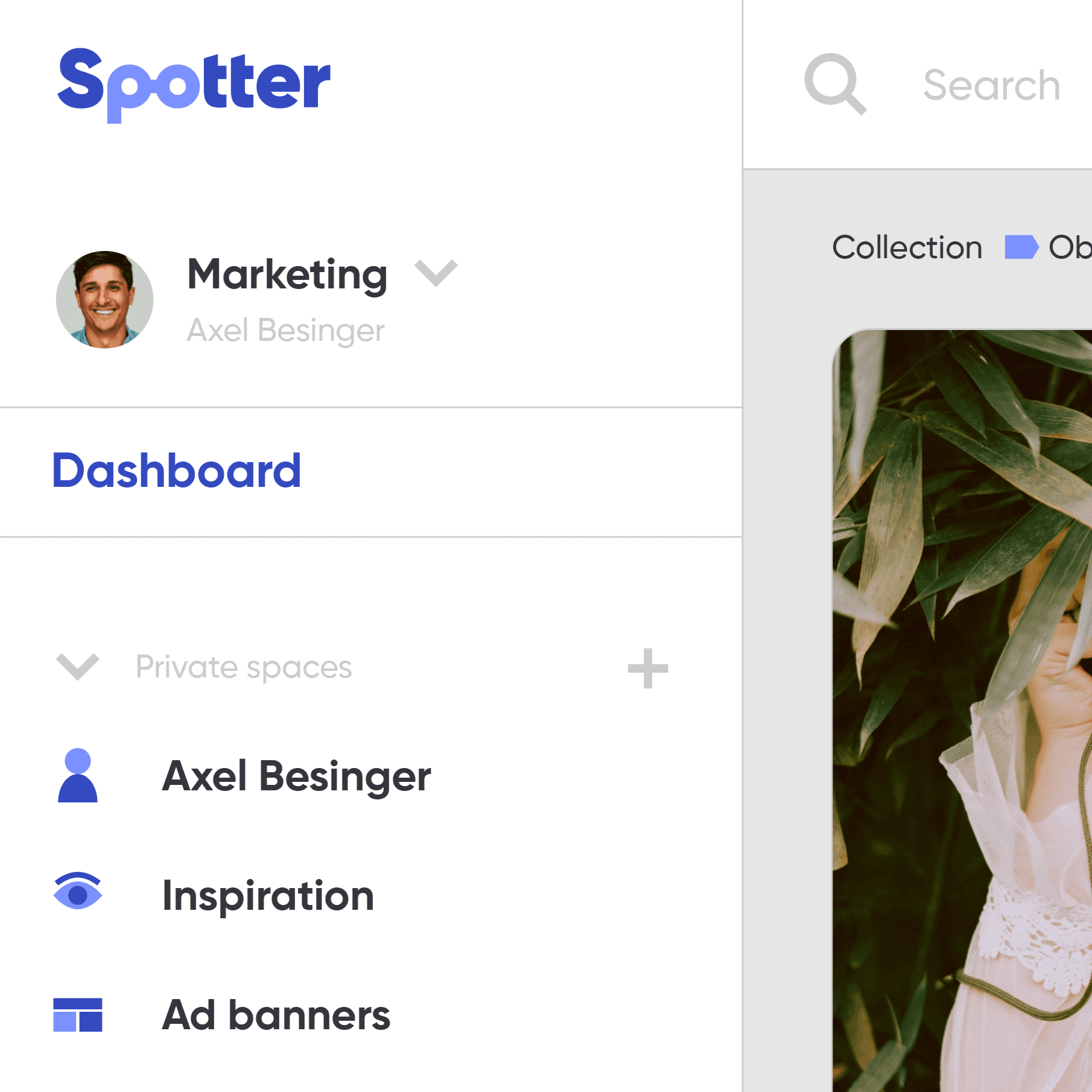
Here’s a mockup for what the web app currently in development looks like. It functions as a search aggregator for all your media sources (online and local), with different collaborative workspaces and other features.
The layout is classic, making the learning curve very easy for most people. To retain people's attention right away, things need to be clear and simple to pickup. That's also why the focus is on the content/assets, and the UI elements take a backseat, remaining easily accessible and useful.
Website
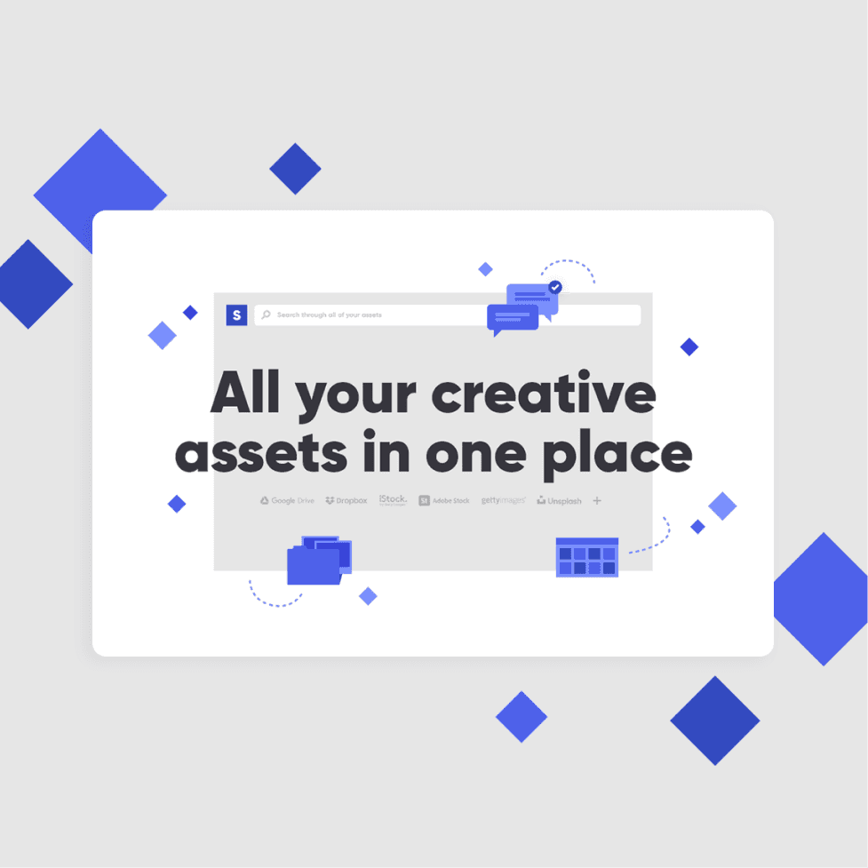
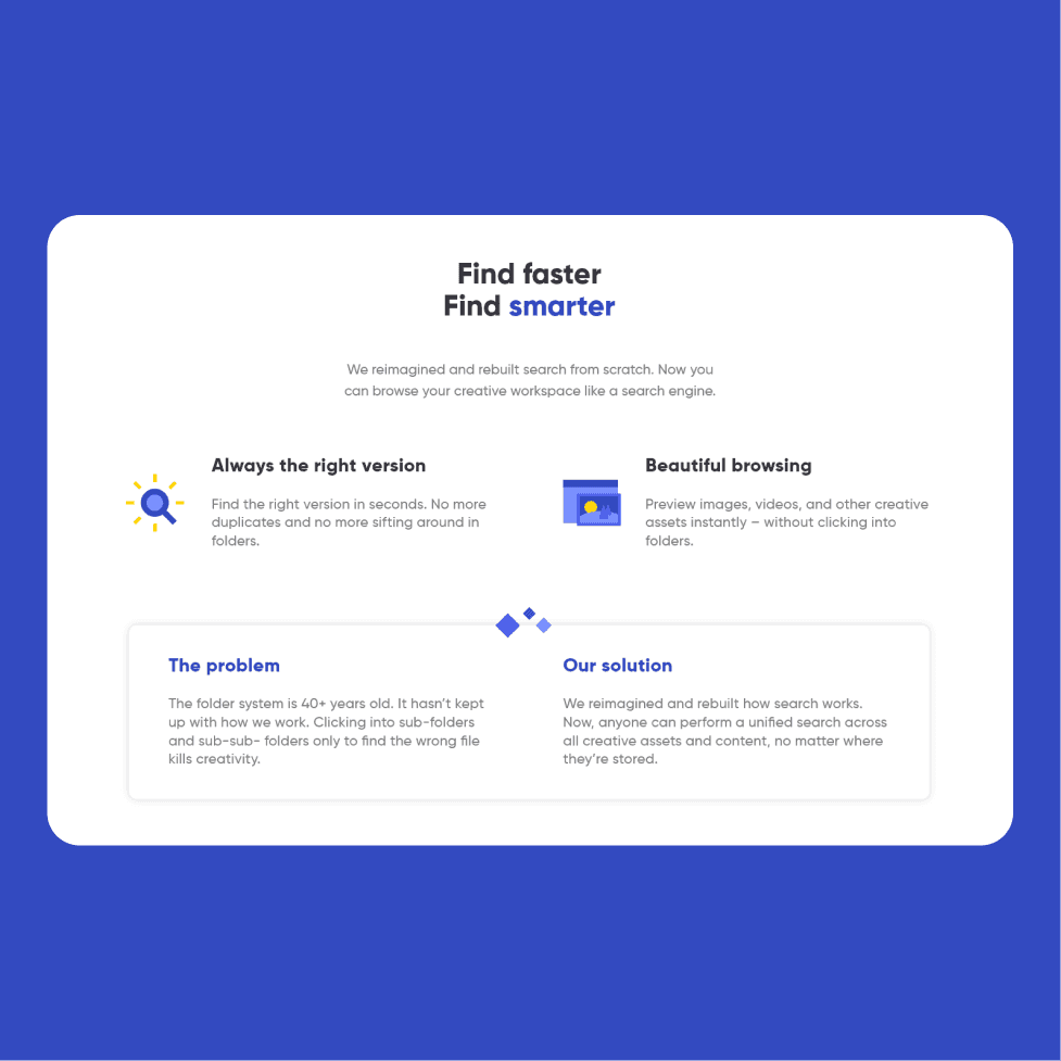
Spotter's home
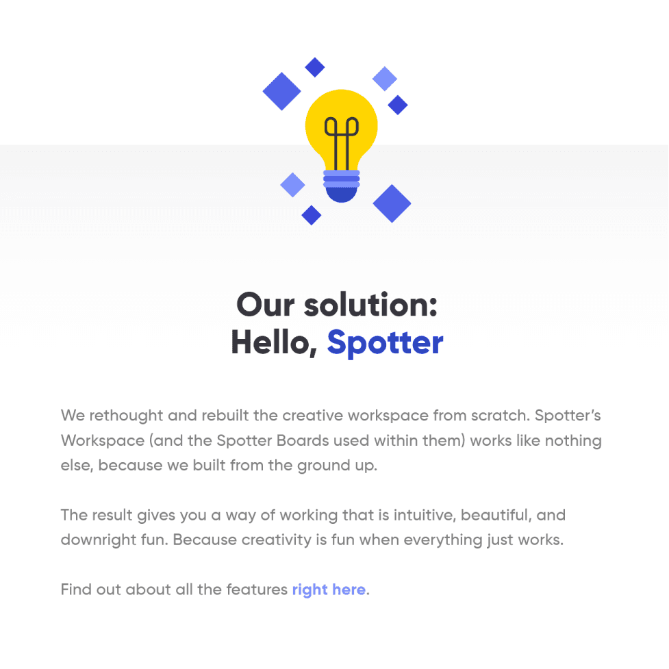
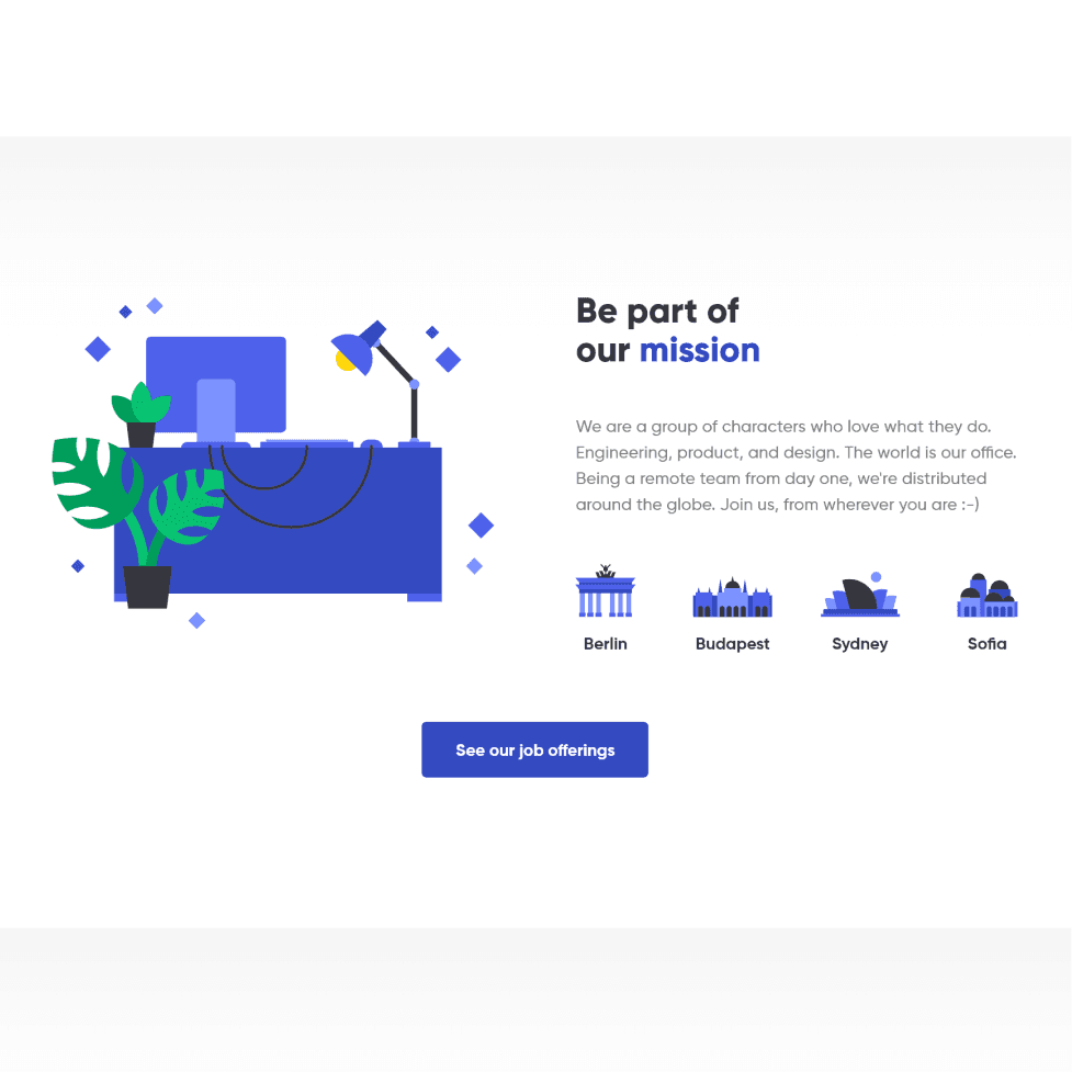
Our Spotter website is based on a simple layout punctuated by fun illustrations and visual elements. The “diamond” shapes are used as a recurring branding element to highlight certain objects and titles.
The goal for this website was to showcase in a clear manner what the app could do, while also showing the great credentials Spotter has. It visually and narratively explains what it does, and showcases selected features.
As the final app UI is still a separate work-in-progress, illustrations and minimal mockups were used to showcase the app’s features.
Icons & illustrations
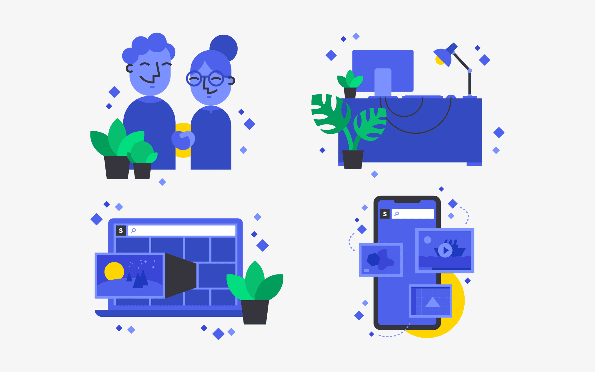
A look at the visuals
Many illustrations and icons were created to support the brand. The issue we had, as part of this first iteration of the branding, was that the app was in development. Therefore, illustrations were needed to illustrate points and features.
They use our palette of blues, as well as other small accents of yellow and greens to break the blue domination. The style is a classic flat minimal, easily reproducible so that the design team can soar on its own.

Oh hey! Nice to have you here.
I can bring your project to life ✨
I hope you're having a nice day!
Let's work together 🪄