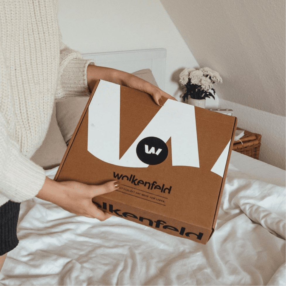
Logo
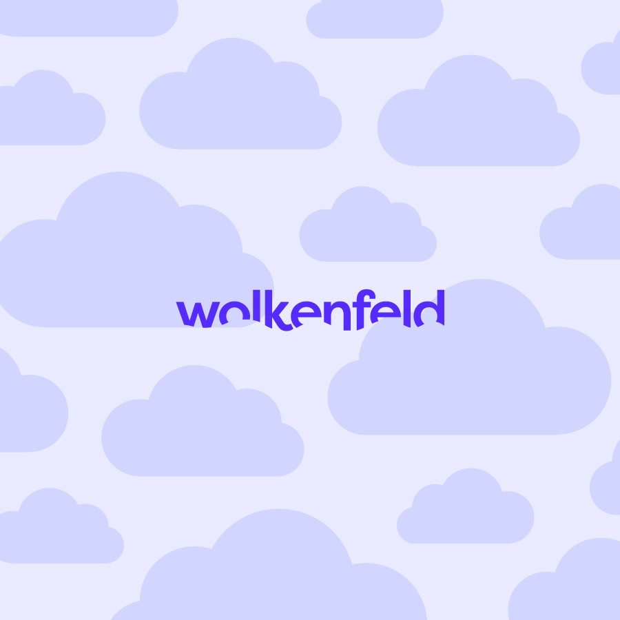
Head in the clouds
Wolkenfeld's logo's first iteration was made before I joined but was refined and expanded, like by redesigning the cloud "line" that cuts through it. It's a strong, modern logotype, that shows a soft side with its cloud cut-out, mirroring the name. The idea was to make it sleek and actual, while giving it a soft touch to complement the product.


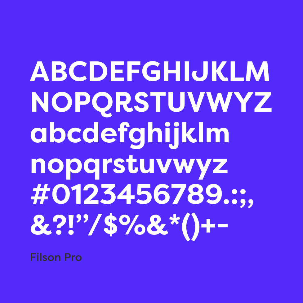
Typography
Describing clouds
Filson Pro is the font family used across the board with Wolkenfeld. The pairing came from the idea of having a clean contemporary font that also had playful elements. The upward-jumping spurs and other fun elements make it stand out against what is often seen in this industry.
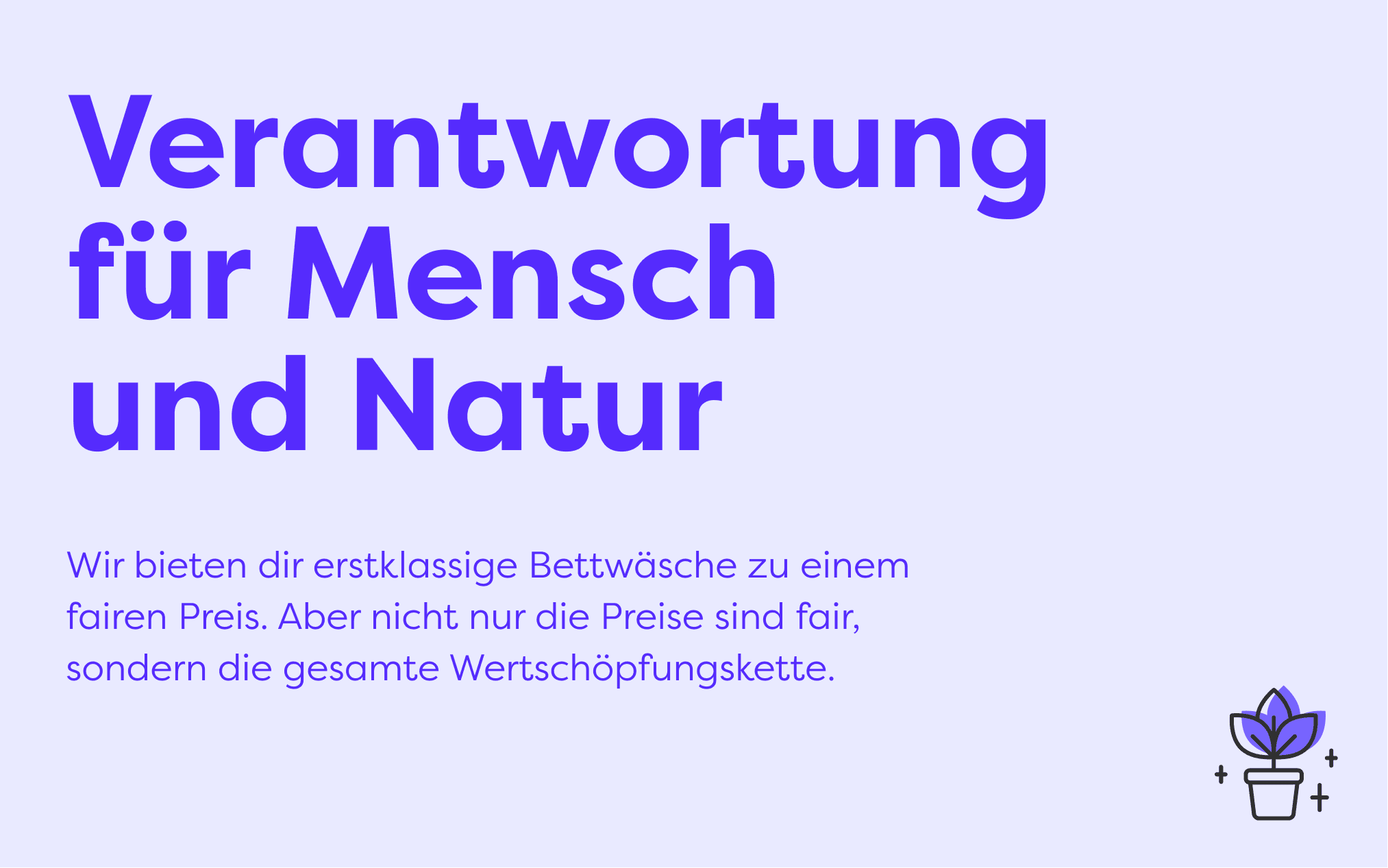
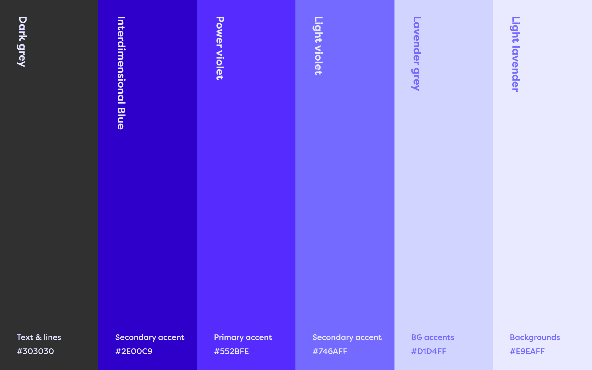
Colors
Relaxing but powerful
To showcase the "dynamic yet cozy" vibe of the brand, we decided on a palette of violets and lavender tones. While almost all of the industry goes with blues and the likes, we decided to go with a slightly more contemporary approach and use something that was both in line with the field, while showing a distinct energetic personality.
Cozy, but never boring.

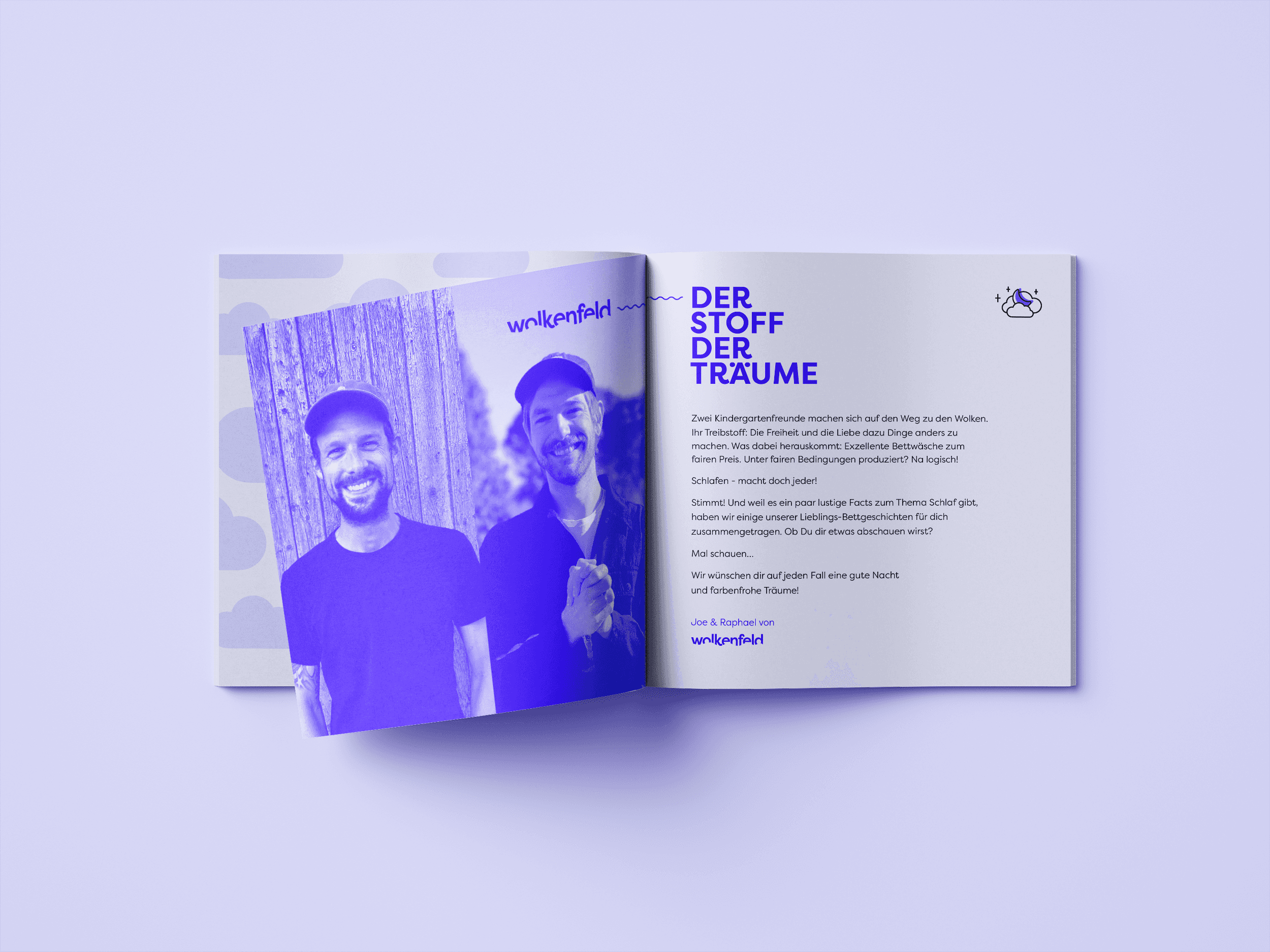
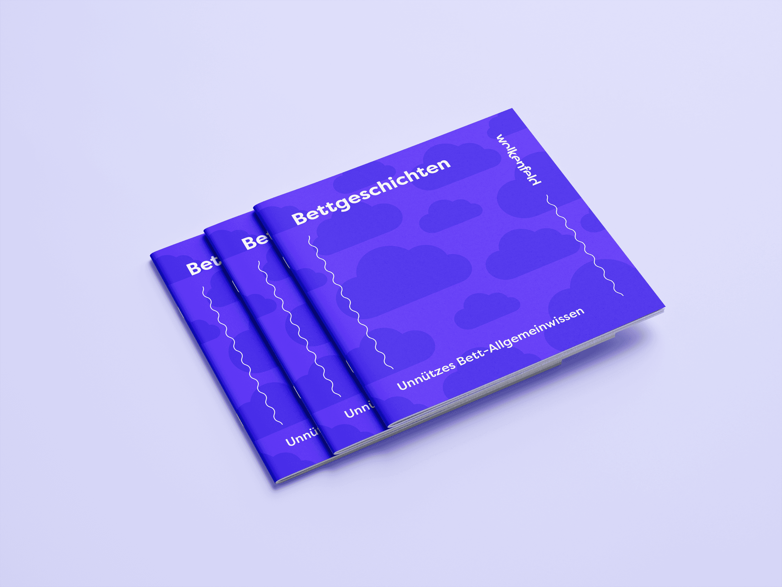
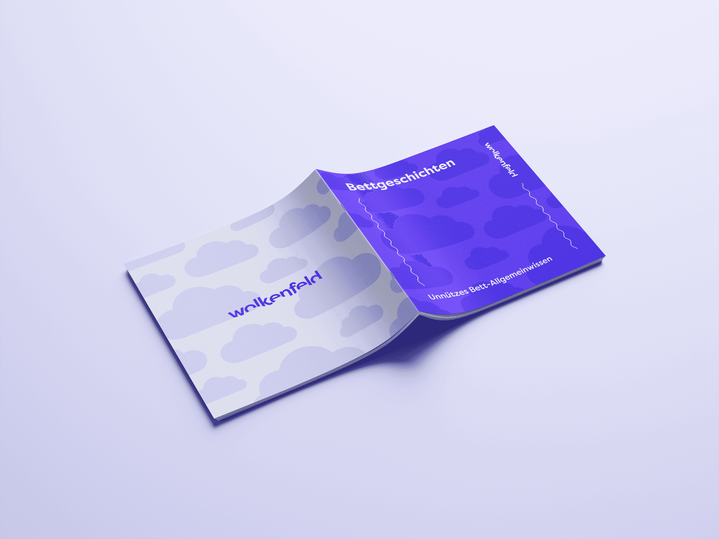
Booklet
An intro to Wolkenfeld
As the company wanted to introduce their new brand, as well as reach their customers in a friendly and personal way, a little booklet that is included with purchases was made. I helps introduce people to the brand, the founders, their vision and mission, and throw in a few fun facts.
It was made to be simple and clean, utilizing the brand colors and elements in a strong, in-your-face way.


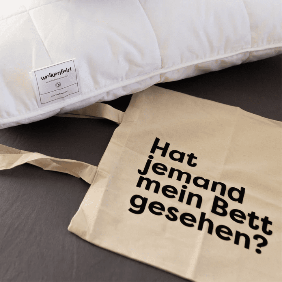
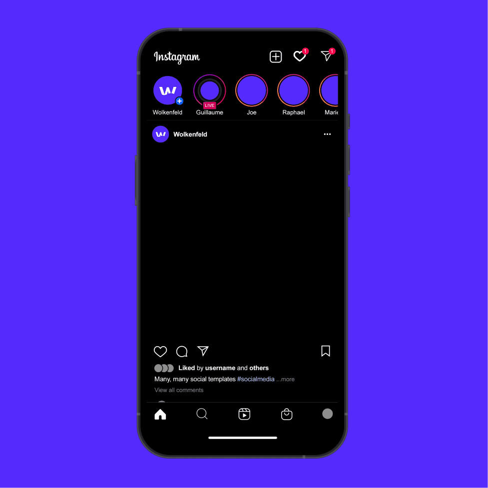
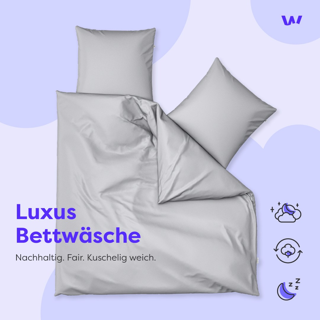
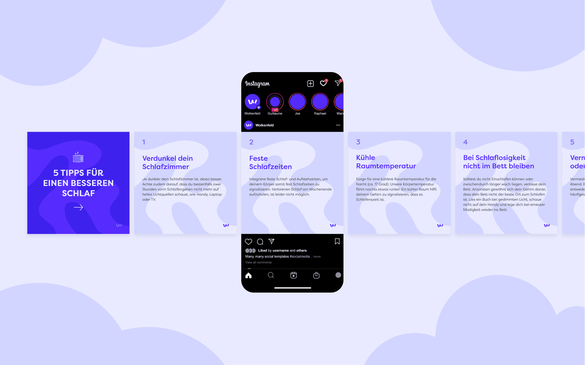
Marketing
Join us in the field of clouds
For Wolkenfeld's marketing, a ton of different avenues were taken. Print, promotional objects, social media posts, animated video ads, etc. The goal was to have different templates for different things, designed mostly around sharing interesting information and facts related to the products, as well as the environmental initiatives that Wolkenfeld takes part in.
Here are a few samples, including a door hanger!
👇 Swipe left or right


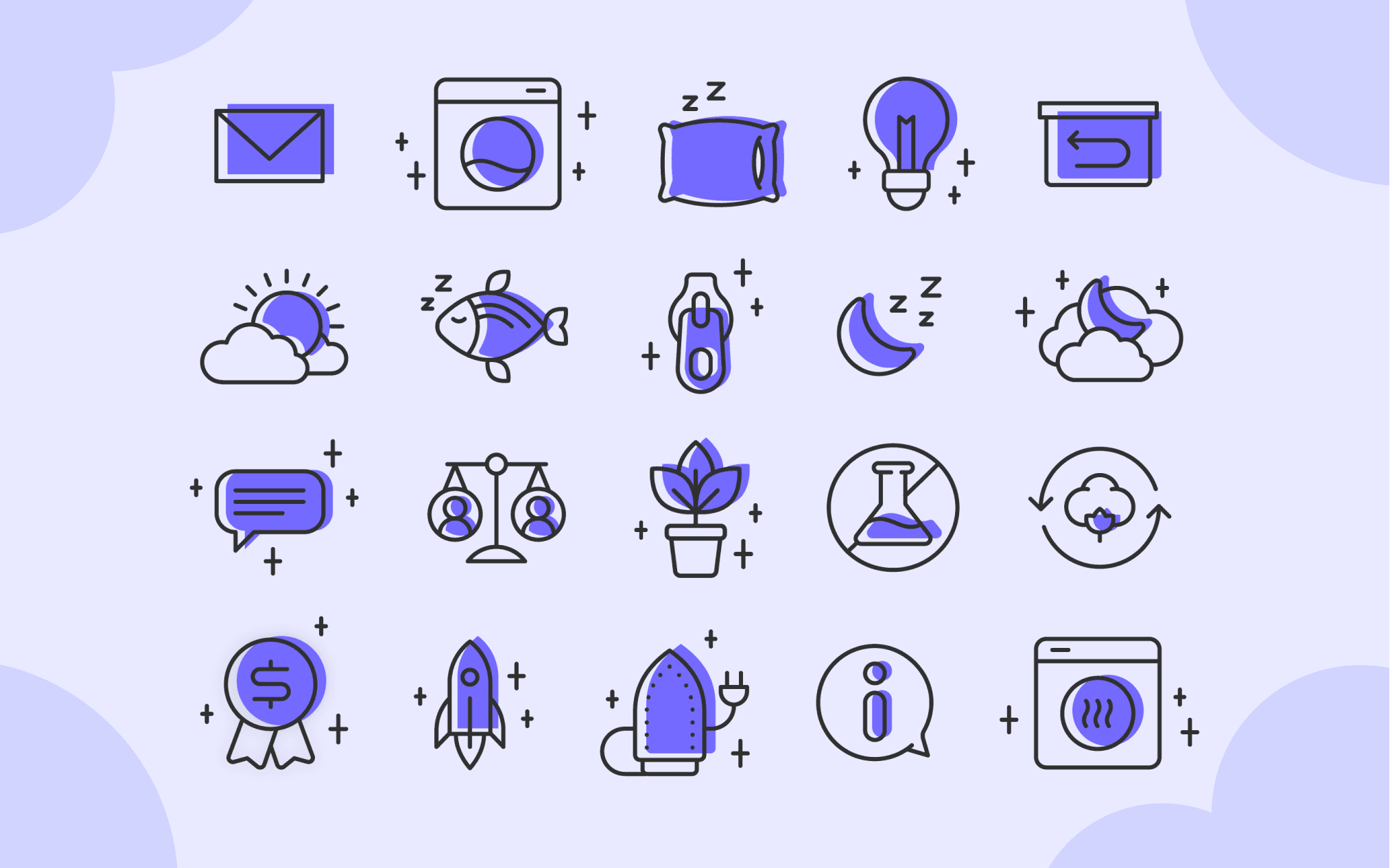
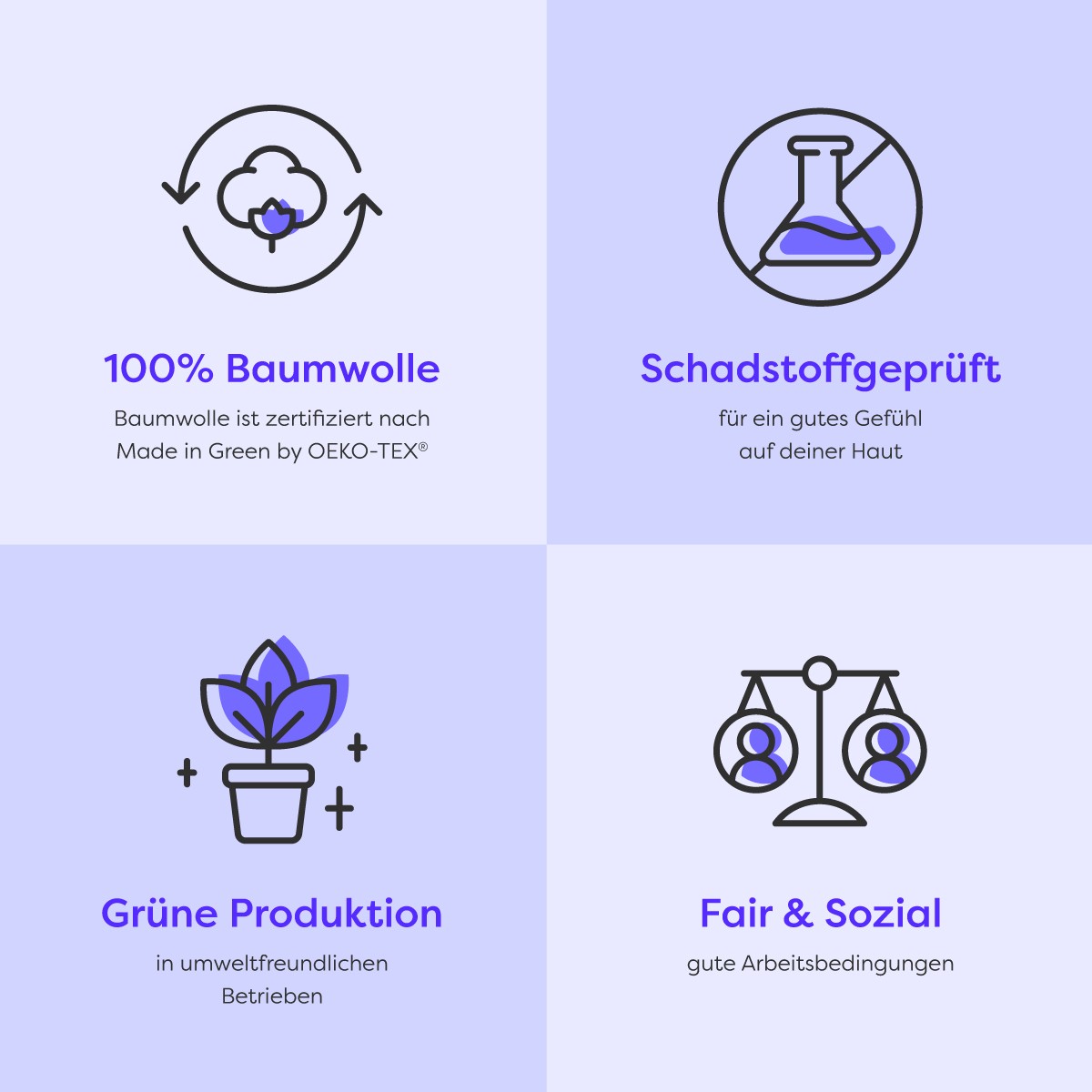
Icons & illustrations
Funky iconography
The icons (or just small illustrations) come back often through the material to illustrate and support points, so they needed to have a visual flair to them that brought us back to our original motto. Cozy, but never boring.
They have a mix of rounded and sharp corners and curves, as well as offset violet fill, to give it a bit of a fun edge. The little stars/cross come back to support the icons visually and give a sense of cleanliness.

Oh hey! Nice to have you here.
I can bring your project to life ✨
I hope you're having a nice day!
Let's work together 🪄