Veyo
Your link with healthcare
Veyo was a startup app dedicated to making the bridge between healthcare professionals and the public. The service was aimed mostly at elderly people and their caregivers, therefore needing to show a soft, caring approach.
I was invited early to pitch in a logo and initial brand identity.
Disciplines
Brand identity
Year
2016

Logo
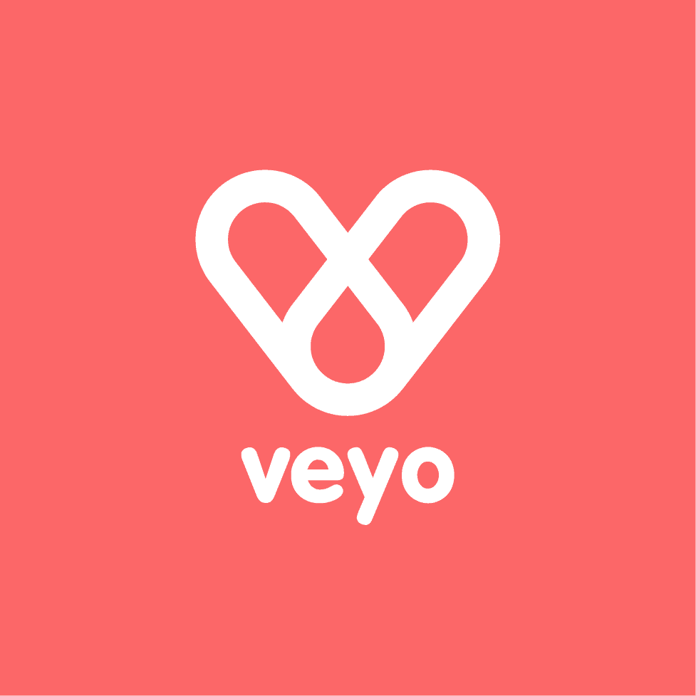
A healthy shape
The logo is a combination of symbols that relate to how Veyo helps older people and the healthcare system.
The glyph represents a "V" for Veyo, a heart to symbolize care and health, and two intertwined links of a chain, symbolizing the strong link between the health professional and the patient.
As for the typeface, I've chosen a soft, rounded-edges font that echoes the caring softness of the logo and mission.


Oh hey! Nice to have you here.
I can bring your project to life ✨
I hope you're having a nice day!
Let's work together 🪄